A Deeper Look into the Melting Arctic
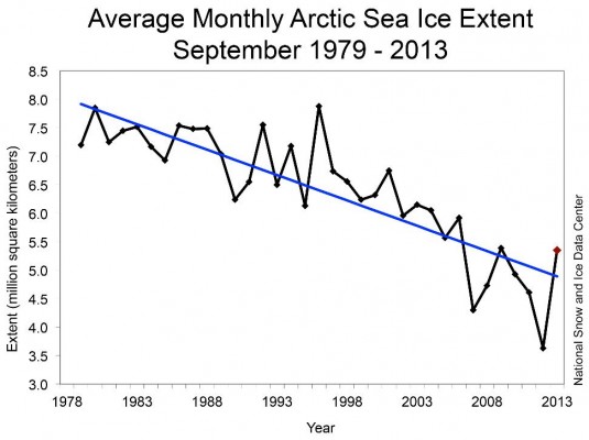
In the “10 Facts of Climate Change” (released April 22nd, 2014), the graph below demonstrates just how precipitous the decline in sea ice has been. The annual minimum amount of ice has decreased precipitously. Two and a half million square kilometers (1 million square miles) of ice has been lost in only 35 years.

From: Sea Ice Index, National Snow & Ice Data Center. http://nsidc.org/data/g02135
Here I would like to expand upon some of the mentioned points.
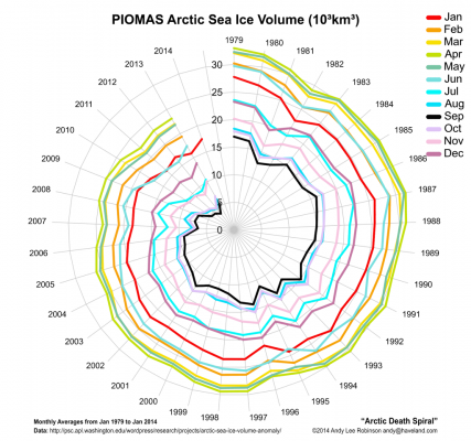
The Arctic “death spiral,” the steady decrease of sea ice, is clear:
In this chart, each color represents a month. By following the lines clockwise, you can see the change in the monthly average volume of Arctic sea ice of each year since 1979. The lines spiral closer and closer to the middle, plainly showing sea ice loss.
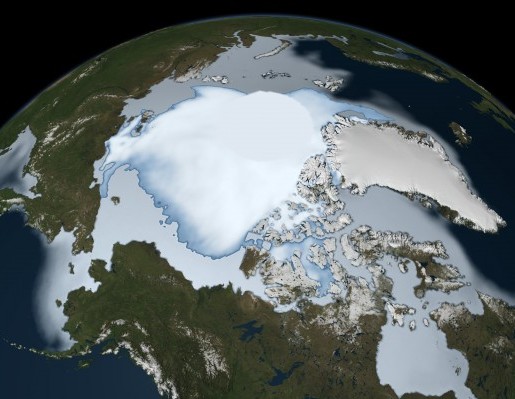
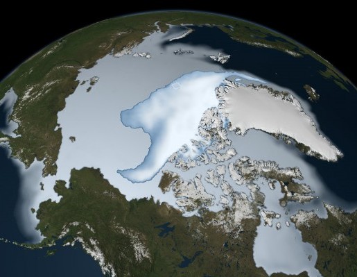
These composite pictures of the polar ice cap, from NASA, clearly illustrate the melting North Pole:

Nov 1, 1979 – Jan 31, 1980, Courtesy NASA

Nov 1, 2011 – Jan 31, 2012, courtesy NASA
The picture on the left shows the Arctic during the Winter of 1979-1980. The picture on the right uses the same point of view but 32 years later, during the Winter of 2011-2012. The differences are stark.
This video created by NOAA visualizes the current vs historical differences of ice levels:
Here is another look at Arctic Ice, including old ice getting replaced by newly formed ice.
Ice cover also acts as a reflective surface, deflecting heat back to space. Conversely, the darker colored ocean absorbs heat and reflects very little of it. This process compounds the fact that younger and smaller quantities of ice is easier to melt than older and more ice. This creates a positive feedback loop, where ice melts more easily and quicker when there is already less ice. Recovery becomes harder and harder with each passing year without remediation.


